Mapping World Development Indicators data in R with ggplot2
In this post we are going to create two world maps:
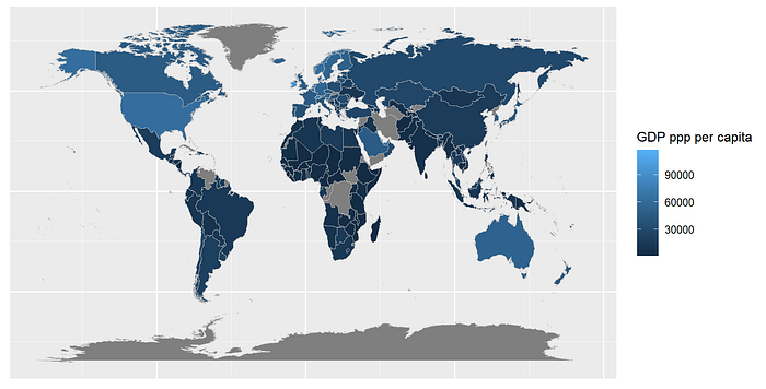
The first one will map GDP PPP per capita data from the World Bank by country. Most data for this map will be available.
The second one will map the prices of fashion products by country on a world map. This map will be different from the previous one because not all data is available.
Libraries
library(ggplot2)
library(tidyverse)
library(plotly)
library(WDI)
Data
The ggplot map_data function contains map libraries that allow you to access geospatial data to map vectors. In this case, we are going to use the world map option.
mapdata <- map_data('world')We use the GDP PPP annual data from the World Bank’s repository. We use the code for GDP PPP per capita “NY.GDP.PCAP.PP.KD”. You can find a list of the indicators available on the Worl Development Indicators package here.
WDI<-WDI(
  country = "all",
  indicator = "NY.GDP.PCAP.PP.KD",
  start = 2020,
  end = 2020,
  extra = FALSE,
  cache = NULL,
  latest = NULL,
  language = "en")
Matching and cleaning data
Now we have two data sets, the next step is to merge them both to create a single dataset we can use The World Bank’s data uses countries' official names, whereas the ggplot map data frame includes countries' short names.
The next step is to map country names in both datasets. We do this by replacing the names in the World Bank data with the sort names. Below is a list of country names that use the official name. For simplicity, we are first going to name bother columns that contain country names “region”, and will subset the last year of GDP pp data.
WDI<-WDI %>%
  rename(region = country, gdp_ppp=NY.GDP.PCAP.PP.KD)WDI$region[WDI$region == "United States"] <- "USA"
WDI$region[WDI$region == "Russian Federation"] <- "Russia"
WDI$region[WDI$region == "Korea, Rep."] <- "South Korea"
WDI$region[WDI$region == "Lao PDR"] <- "Laos"
WDI$region[WDI$region == "United Kingdom"] <- "UK"
WDI$region[WDI$region == "Egypt, Arab Rep."] <- "Egypt"
WDI$region[WDI$region == "Turkiye"] <- "Turkey"
WDI$region[WDI$region == "Czechia"] <- "Czech Republic"
WDI$region[WDI$region == "Syrian Arabian Republic"] <- "Syria"
WDI$region[WDI$region == "Yemen, Rep."] <- "Yemen"
WDI$region[WDI$region == "Venezuela, RB"] <- "Venezuela"
WDI$region[WDI$region == "Cote d'Ivoire"] <- "Ivory Coast"WDI1<-WDI%>%select(region,income_class,gdp_ppp)
Then we do a left join to merge all data into a single data frame.
mapdatax<-left_join(mapdatax,WDI1,by='region')Creating a world map
Ggplot will create a map using the coordinates of the ‘world’ data frame. We use the geom_polygon function to fill the map with the data we need, in this case, country GDP ppp per capita.
mapdatax%>%
  ggplot(aes(x=long,y=lat,group=group))+
  geom_polygon(aes(fill=gdp_ppp),color="grey",size = 0.2)+
  labs(fill= "GDP ppp per capita")+
  theme(axis.title=element_blank(),axis.text=element_blank(),
        axis.ticks=element_blank() )
